In order to perform brain connectivity analysis, the first essential step is to obtain information about the brain connectivity matrix. To this end, the brain is divided into several (typically between 50 and 1000) regions, and the connection strength between each pair of regions is measured. The definition and measurement of this strength depends on the neuroimaging modality used to acquire the data. Currently, BRAPH deals with two categories of data:
- Structural data acquired with magnetic resonance imaging (MRI) or glucose metabolism data acquired with static positron emission tomography (PET). These neuroimaging techniques provide a brain image for each subject of a group, i.e. a value (e.g. cortical thickness, gray matter volume, glucose metabolism) for each brain region of each subject. The connectivity strength between two regions can be measured as the correlation between the values corresponding to these two regions across the group. A possible underlying assumption is that connected regions will grow or shrink together or show similar levels of glucose metabolism. Therefore, these techniques provide a single brain connectivity matrix for each group.
- Functional data acquired with functional magnetic resonance imaging (fMRI) and electroencephalography (EEG). Functional neuroimaging techniques provide a sequence of images that show the activation of various brain regions as a function of time for each subject. The connectivity strength between brain regions can be measured as the correlation between their activation levels as a function of time. The underlying assumption is that functionally connected regions get activated together. Therefore, this technique provides an individual brain connectivity matrix for each subject.

A graph consists of a set of nodes that are connected by edges. Figure 1(a) shows an example of a simple graph, where the nodes are represented by circles and the edges by lines. This representation of a graph is very intuitive, but can become very complex and cluttered as soon as the numbers of nodes and edges start to grow.
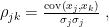
Figure 1(b) shows that an alternative way to represent a graph is using a connectivity matrix.[1] The use of connectivity matrices permits one to employ highly-optimized algorithms based on linear algebra.[2] The elements of the matrix represent the edges between nodes; for example, the element 


Based on the nature of the edges’ weight and directionality, four types of graphs can be identified (figure 2):
- Weighted directed (WD) graphs. The edges are associated with a real number indicating the strength of the connection and are directed (therefore, node
- Weighted undirected (WU) graphs. The edges are associated with a real number indicating the strength of the connection and are undirected (therefore, if node
- Binary directed (BD) graphs. The edges can be either
(absence of connection) or
(existence of connection) and are directed.
- Binary undirected (BU) graphs. The edges can be either

As shown in figure 2, it is possible to transform these graphs in the following ways:
- Weighted to binary. It is possible to transform a weighted graph into a binary one by thresholding, i.e. by assigning a value of
- Directed to undirected. It is possible to transform a directed graph into an undirected one by symmetrization, i.e. by removing the information about the edge directions. This is done by binarizing the connectivity matrix representing the directed graph. There are several possible rules for the symmetrization, e.g.:
- Sum. Addition of the connectivity matrix and its transpose.
- Average. Average of the connectivity matrix and its transpose.
- Minimum. Connectivity matrix and its transpose are compared and the smallest value for each entry is used.
- Maximum. Connectivity matrix and its transpose are compared and the largest value for each entry is used.
Nodes: Brain regions
The nodes are brain regions. The nodes should be chosen so that they do not overlap with each other and cover the whole brain.[3] The choice of nodes is not unique and can be derived from many anatomical atlases used in MRI, fMRI and PET, or from the locations of the electrodes in EEG. The choice of the nodes is very important because it influences the topology of the brain graphs, the strength of the connections, and also the values of the calculated graph measures[4]. Therefore, two brain graphs can only be quantitatively compared if they are built using the same brain atlas.
In BRAPH the choice of the parcellation scheme is inputted in the GUI Brain Atlas interface. In this manual, we use the AAL90 (Automated Anatomical Labeling – 90 regions) atlas[5] and the Desikan atlas[6].
Edges: Brain connections
The edges represent the connections between brain regions. As we have seen in the previous section, the edges can indicate absence/presence of connections (binary graphs) or the strength of the connections (weighted graphs). Depending on the nature of the neuroimaging data, the edges can be interpreted in different ways. For example, in the case of structural MRI (T1-weighted) or static PET the edges represent the correlation coefficients between couples of brain regions. In the case of functional connectivity data, the edges may represent the time correlations between the activation of pairs of brain regions. In the following sections, we will explain how to build the connectivity matrices for some of the most common brain imaging techniques.
Building the connectivity matrix
MRI
Magnetic resonance imaging (MRI)[7] is a non-invasive and non-ionizing imaging technique that gives quickly-obtainable and easy-to-interpret images acquired as 3D data sets. MRI uses relatively low magnetic fields and is able to distinguish between different tissues by sending radio-frequency (RF) pulses with various frequencies and strengths thanks to the fact that different tissues have different proton density, and proton density determines the strength of the interaction with the external magnetic field.
In neuroimaging, MRI can be used to show the shape and structure of the grey and white matter in the brain. Since more cell bodies are present in the gray matter (where neurons and glial cells are present) compared to the white matter (in which mostly long nerve fibers are present), their MRI signals are different. The contrast in the image is obtained by observing the different relaxation times of the protons present in different tissues. One of the most common images obtained with MRI are T1-weighted images.
Before the connectivity matrix can be built, all T1-weighted images obtained with MRI need to be preprocessed using an external software (e.g. FreeSurfer[8]). The preprocessing may include several steps, e.g. correction for spatial distortions due to field inhomogeneity, tissue segmentation and normalization to a template.After preprocessing the images, the gray matter volume or cortical thickness should be extracted for each region of the brain atlas. Finally, a linear regression can be applied to the regions in order to exclude the effects due to variables such as age, gender, education.[9]
In order to be uploaded into BRAPH, the data need to have a single value (e.g. cortical thickness, subcortical volume) per brain region per subject. Therefore, the nodes in the connectivity matrix need to correspond to the brain regions of the brain atlas employed in the analysis. The edges are calculated as the statistical correlations of the values between pairs of brain regions across a group of subjects. A group typically includes the subjects sharing a common property (e.g. the same clinical diagnosis). Therefore, a single connectivity matrix is obtained for each group of subjects and consequently all the measures calculated for the connectivity matrix reflect the group’s properties. The workflow for the calculation of the connectivity matrix is shown in figure 3. Note that:
- all self-connections are eliminated (i.e. the diagonal entries of the connectivity matrix, which correspond to the autocorrelations, are set to zero);
- the negative correlations can be (1) excluded from the analysis by setting them to zero, (2) substituted by their absolute values, or (3) left unchanged (however, in this latter case, some graph measures are not defined for negative correlations).

(1) A T1-weighted MRI image is preprocessed to account for some artifacts and a meaningful variable is extracted for each brain region defined by the chosen parcellation scheme (e.g. cortical thickness, subcortical volume).
(2) Correlation coefficients are calculated for each pair of brain regions in the brain across the subjects of a group.
(3) The connectivity matrix is built such that the rows and the columns represent the brain regions and the entries are the correlation coefficients between each pair of brain regions.
In BRAPH, a connectivity matrix can be built using any of the following correlation functions:
- Pearson correlation coefficient is calculated as
where 


- The Spearman rank correlation coefficient is defined as the Pearson correlation coefficient between the ranked variables. This coefficient measures the correlation between two ranked variables with monotonic relation between them. The ranks are assigned to each value in the data such that the highest value is ranked 1 (if there is a “tie”, i.e. two values of same rank, their average rank is assigned to both). The coefficient ranges from -1 to 1 with the same interpretations of the positive and negative values as explained in the Pearson correlation coefficient. The Spearman’s rank coefficient is a non-parametric version of Pearson coefficient and as such the relation between the ranks of the data it reveals (monotonic) is less restrictive than the one of the Pearson coefficient (linear).
- The Kendall rank correlation coefficient is a non-parametric test that measures the correlation between two ranked quantities. It can be calculated by considering all the pairings between the data sets
and
. Consider the pairs
and
, where
and
and
data value in the
and
is valid or equivalently
and
is valid the pair is considered concordant. Otherwise, the pair is discordant. In the case
or
the pair is tied. The range for the correlation is
- Partial correlation coefficients. Partial correlation coefficients are the correlation coefficients between two sets of data after removing the influence of one or more variables on the two data sets. Both Pearson and Spearman partial correlation coefficients can be calculated in BRAPH.
fMRI
Functional magnetic resonance imaging (fMRI)[10] is a neuroimaging technique that is used to measure the blood-oxigen-level-dependent (BOLD) activity of the brain, differently from structural MRI which measures the anatomical properties of the brain.
The foundation for fMRI lies on the observation that an increased activity in a part of the brain results in an enhancement of the corresponding magnetic resonance signal. The reason is that neural activity is associated with increases in blood flow and oxygenation. Since oxygen-rich and oxygen-poor blood has different magnetic properties, this results in a contrast in the magnetic resonance signal. This information can be obtained for subjects performing some special tasks (e.g. looking at a picture) or also while no explicit task is performed (resting state fMRI). In both cases, multiple images are obtained which show the brain activity as a function of time.
In contrast to MRI, fMRI data provide a time-series of values corresponding to each brain region. Therefore, an individual connectivity matrix can be obtained for each subject by calculating the temporal correlations between the activation of couples of brain regions, and the graph measures are calculated for each subject. As in the case of structural MRI, the nodes are the brain regions and the edges are calculated as correlation coefficients. The groups of subjects are built by grouping subjects sharing some common properties (e.g. same clinical diagnosis).
EEG and PET
In addition to MRI and fMRI data, BRAPH permits the analysis of the data obtained by static PET[11] and EEG[12]. Since their workflow is similar to the one of MRI and fMRI, respectively, we refer the reader to the respective sections for more details.
Statistical significance
Permutation test
Statistical significance tests are used to determine whether a measured effect is genuine or is a statistical glitch due to the randomness associated with the selection of the sample. BRAPH employs a non-parametric permutation test to assess the significance of the differences between groups (reported as p-values) and to determine the confidence intervals (typically the 
The null hypothesis is the statement that an observed effect is due to randomness. The permutation test evaluates whether the null hypothesis can be rejected by calculating the associated p-value (i.e. the probability to observe a value of the measure that is as extreme or more extreme than the observed value just by chance) and comparing it with a predetermined threshold (typically, 


In particular, the permutation test is employed to compare the measures calculated for two groups of subjects. In detail:
- Determine the difference between the measures calculated for the two groups.
- Permute the subjects between the two groups; calculate the difference between the measures calculated for the permuted groups. Repeat this step several times (typically 1000 times) and obtain the histogram of the differences.
- Determine where the difference between the measures calculated in the two groups lies within the histogram and compare this value with the chosen threshold (as shown in figure 4).
Comparison with random graphs
To compare the measures calculated for one group to those of corresponding random graphs, the following procedure is followed:
- Determine the value of the measure for the group.
- Calculate the distribution of the measure on a set (typically 1000) of random graphs[13] and obtain the corresponding histogram.
- Determine where the value of the measure falls within the histogram.
False discovery rate (FDR)
In the case of nodal measures, the permutation test tests multiple null hypotheses simultaneously (one for each brain region). This means that the likelihood of false significance increases.[14] Therefore, the significance level needs to be adjusted and the p-values need to be corrected accordingly. BRAPH does this by using the false discovery rate (FDR) algorithm.
The false discovery rate is corrected by using the Benjamini-Hochberg procedure, which follows the ensuing steps (figure 5):
- Obtain all the individual p-values for each hypothesis testing and arrange them in order starting from the smallest one (i.e. the smallest one has rank
, the largest
, where
is the number of hypotheses tested).
- Choose the false discovery rate
(typically,
).
- Compare each of the individual p-values with their false-rate-corrected values calculated by
.
- Find the largest p-value that is smaller than the corresponding false-rate-corrected value.
- The value in the previous point is significant as well as all p-values that are smaller; therefore, all hypothesis having smaller p-values pass the test, regardless of whether they are larger than the corresponding false-rate-corrected values.
 (here, Q=0.10). The largest p-value that is smaller than the corresponding false-rate-corrected value is significant as well as all hypothesis having smaller p-values (regardless of whether they are larger than the corresponding false rate corrected values).
Footnotes and references
- ^ The specific order of the nodes in the matrix does not affect the calculation of the graph measures, but only the graphical representation of the connectivity matrix.
- ^ Kepner, Jeremy, and John Gilbert, eds. Graph algorithms in the language of linear algebra. Vol. 22. SIAM, 2011.
- ^ Rubinov, Mikail, and Olaf Sporns. “Complex network measures of brain connectivity: uses and interpretations.” Neuroimage 52.3 (2010): 1059-1069.
- ^ Wang, Jinhui, et al. “Parcellation‐dependent small‐world brain functional networks: a resting‐state fMRI study.” Human brain mapping 30.5 (2009): 1511-1523.
- ^ Tzourio-Mazoyer, Nathalie, et al. “Automated anatomical labeling of activations in SPM using a macroscopic anatomical parcellation of the MNI MRI single-subject brain.” Neuroimage 15.1 (2002): 273-289.
- ^ Desikan, Rahul S., et al. “An automated labeling system for subdividing the human cerebral cortex on MRI scans into gyral based regions of interest.” Neuroimage 31.3 (2006): 968-980.
- ^ Brown, Robert W., et al. Magnetic resonance imaging: physical principles and sequence design. John Wiley & Sons, 2014.
- ^ Fischl, Bruce. “FreeSurfer.” Neuroimage 62.2 (2012): 774-781.
- ^ He, Yong, Zhang J. Chen, and Alan C. Evans. “Small-world anatomical networks in the human brain revealed by cortical thickness from MRI.” Cerebral cortex 17.10 (2007): 2407-2419.
- ^ Huettel, Scott A., Allen W. Song, and Gregory McCarthy. Functional magnetic resonance imaging. Vol. 1. Sunderland: Sinauer Associates, 2004.
- ^ Walker, Ronald C., et al. “Introduction to PET imaging with emphasis on biomedical research.” Neurotoxicology 25.4 (2004): 533-542.
- ^ Teplan, Michal. “Fundamentals of EEG measurement.” Measurement science review 2.2 (2002): 1-11.
- ^ These random graphs typically are chosen to preserve the degree and strength distributions of the original graph.
- ^ For example, using a
threshold for the p-value, one would expect to reject the null hypothesis
times in
trials just by chance.